courts clay
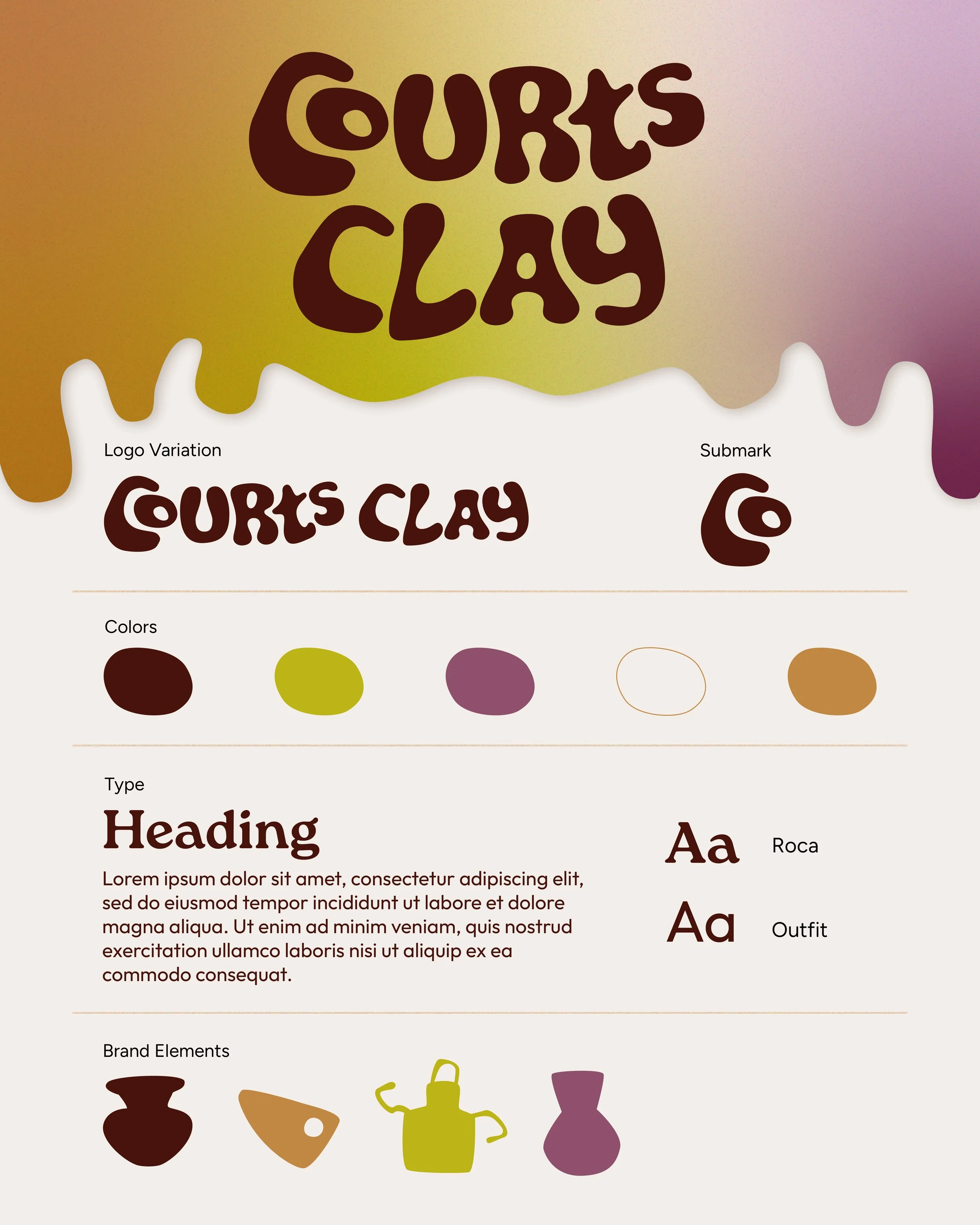
If I had a pottery studio, this would be the brand design I’d use. Welcome to my brand box series, where I design brand essentials for hypothetical businesses. Starting with a hobby I dabble in from time to time: pottery.
The design breakdown:
•The main ‘C’ and ‘o’ create an abstract shape that represents a curved hand cupping wet clay on a spinning pottery wheel.
•The colored gradient texture in the background resembles the color and flow of glaze.
•Embellished with a custom illustration of items you’d see in a pottery studio.
These custom brand designs are available for purchase. Once you buy the design, it’s yours forever, and no one else can claim it. Email to find out more!
courts cones
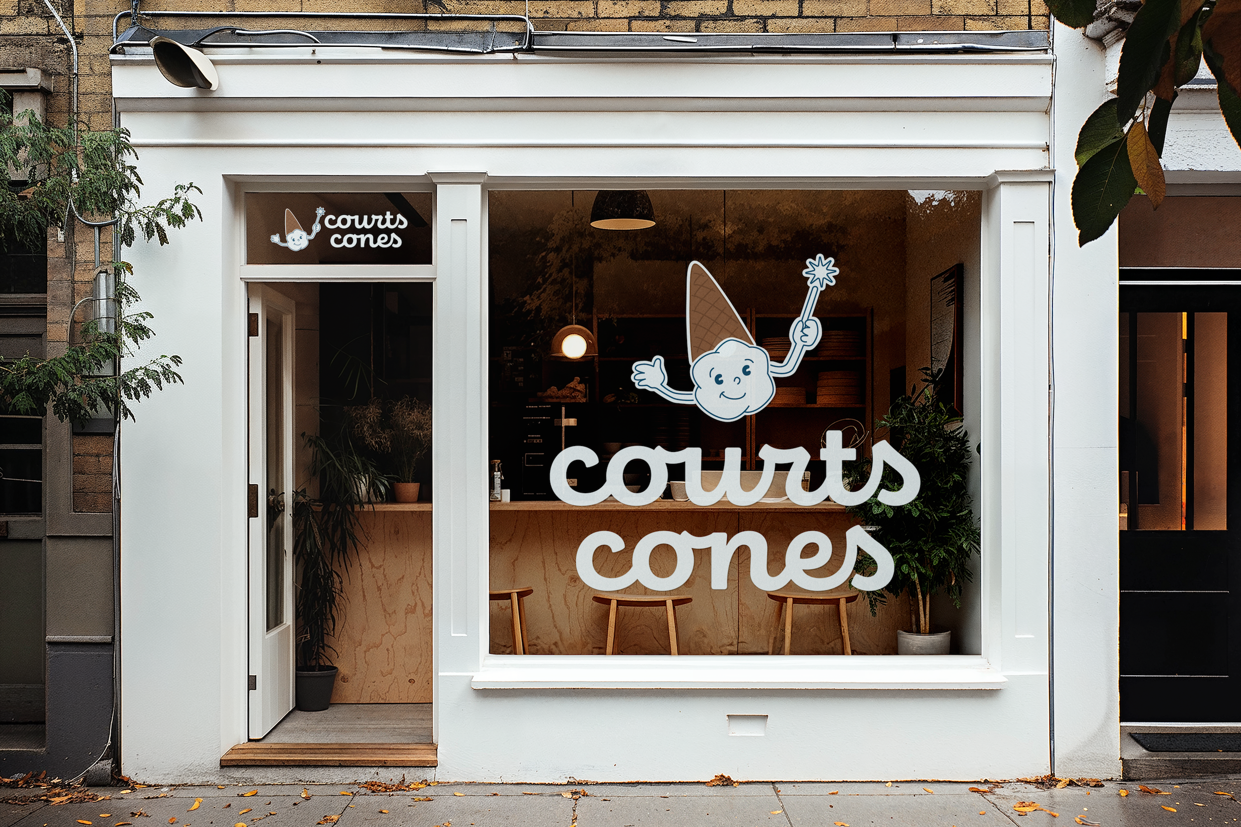
July is National Ice Cream Month! Continuing my series where I design exclusive, one-of-a-kind brand guides for hypothetical businesses, here is what my ice cream shop branding would look like!
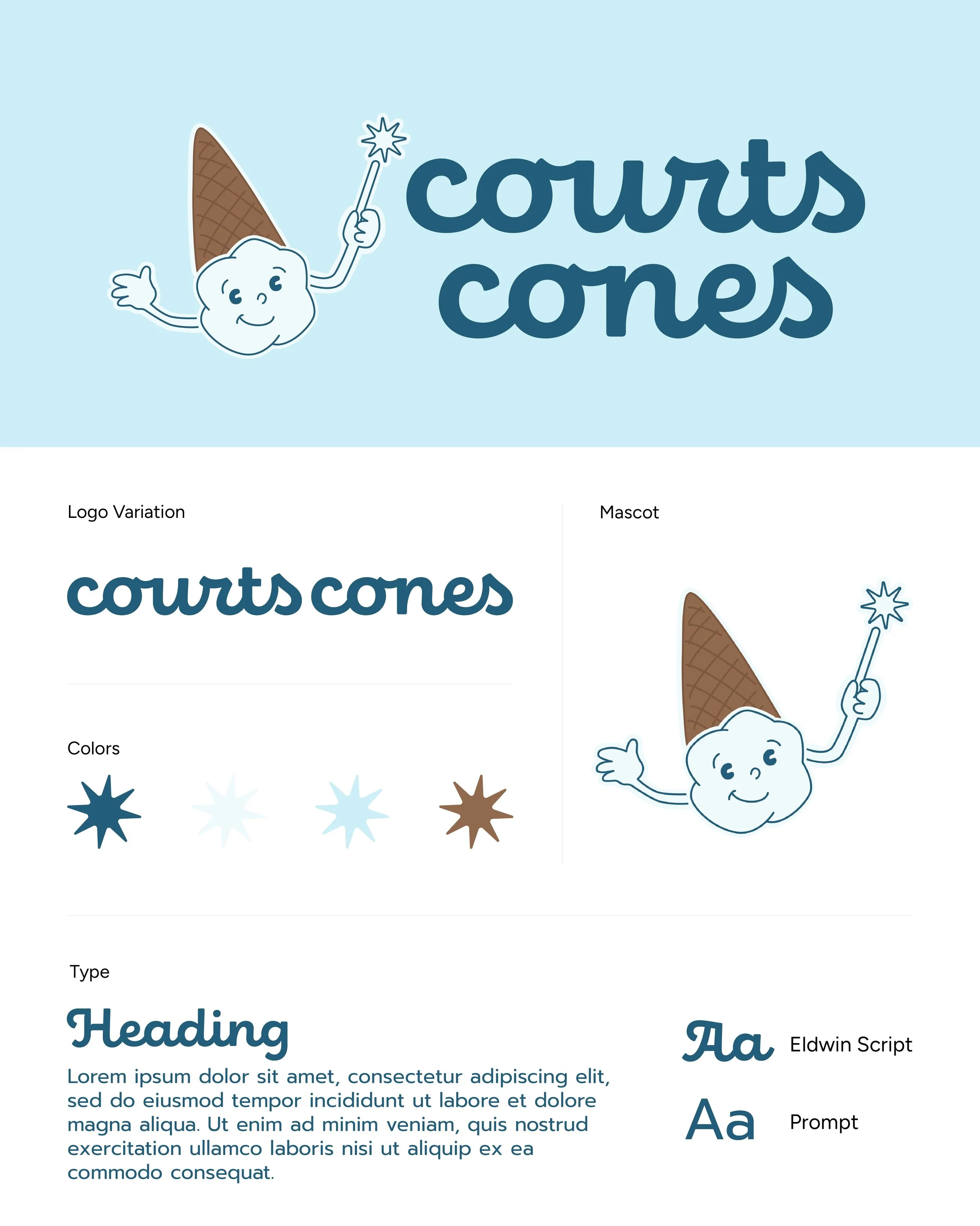
The visual identity of this brand was built around the magical, fresh, and nostalgic theme of ice cream cones. Here’s a breakdown of the design choices:
•The Logo: Classic and timeless typography to mimic the joy of ice cream.
•The Palette: Designed to evoke a fresh, icy, and friendly feeling.
•The Mascot: The anchor of this brand identity, bringing a magical and nostalgic element. The eyes reinforce the c c in Courts Cones.
These custom brand guides are available for purchase. Once you buy a guide, it is yours forever, and no one else can ever claim it.
If you would like more details about this design or inquire about claiming it for your business, please send me an email to find out more.